Katili Corp Logo
Brief :
Create a modern and minimalist studio logo that also tells the history of a company founded by the hard work of a student.
Solution :
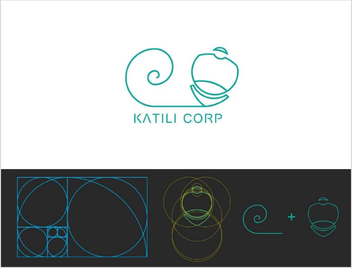
The logo is built with the golden ratio method, a design measurement concept where every angle and plane keeps a balance and consistency at a ratio of 1.618. This is what represents “modern and minimalist”.
The shape of the logo is a bag being dragged. Behind the bag, at the bottom, the bag looks like it is scratching a tail of wind that forms a Fibonacci line, which is closely related to the golden ratio, beauty, and perfection. The bag represents the student, and the line represents every struggle and hard work that has been gone through, which has become a beautiful and perfect stroke.
Snapshot :
| Logo explanation |
|---|
 |